Table of Contents
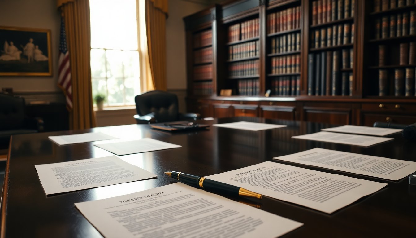
The U.S. State Department has announced a significant change in its official communication standards. Under the direction of Secretary of State Marco Rubio, diplomats are now required to use the classic Times New Roman font for all formal documents. This decision reverses the previous administration’s choice of Calibri, which was intended to improve accessibility for individuals with certain visual impairments.
Rubio’s directive, outlined in a memo dated December 9, criticizes the earlier transition to Calibri, calling it a wasteful initiative linked to diversity efforts. The Secretary aims to restore a sense of decorum and professionalism in the department’s communications, highlighting the role of typography in influencing the perception of official documents.
Background of the font switch
In January, Secretary Antony Blinken opted for Calibri as the standard typeface, citing its modern design as advantageous for individuals facing challenges such as dyslexia and low vision. Calibri, a sans-serif font, was chosen based on studies suggesting its readability benefits for certain disabilities. This decision sought to align the department’s practices with current accessibility standards.
However, Rubio’s recent actions signal a return to a more traditional approach, distancing the department from policies he considers woke. In his communication, he stated that the previous decision undermined the seriousness and formality of official correspondence, arguing that Calibri’s design is too informal for governmental communications.
Reasons behind the change
One key point in Rubio’s memo is the assertion that typography is vital for maintaining the professionalism of official documents. He contends that Times New Roman, with its narrower and more structured appearance, is better suited for formal communications compared to the broader and softer shapes of Calibri. This return to traditional font standards aligns with the President’s directive for a unified voice in America’s foreign relations.
The impact of diversity initiatives
Rubio’s decision reflects a broader political context, where federal DEIA (Diversity, Equity, Inclusion, and Accessibility) initiatives are facing increased scrutiny. The current administration has expressed a desire to dismantle what they view as unnecessary bureaucratic measures associated with diversity programs. The Secretary’s memo explicitly mentions the intention to eliminate what he considers a wasteful DEIA program, marking a clear shift in policy priorities.
This move aligns with trends observed during the Trump administration, which sought to roll back diversity initiatives across government agencies. Critics argue that these policies undermine meritocracy and foster discrimination against specific groups. Conversely, advocates assert that DEIA programs are essential for creating equitable work environments.
Future implications
The reintroduction of Times New Roman as the standard font for the State Department signals a statement about the current administration’s values and priorities. It indicates a desire to reaffirm traditional norms and reinforce professionalism in governmental communications. As the department implements these changes, the impact on accessibility and inclusivity within official communications will likely remain a topic of discussion.
Rubio’s directive not only reflects a shift in font preferences but also encapsulates a broader ideological debate regarding the role of diversity and inclusion in government practices. As these changes unfold, they will undoubtedly affect the tone and perception of U.S. diplomacy on the global stage.